pandas - brazil ecommerce dataset ( 1 )
1. 실제 데이터 분석과 도메인의 이해
- 데이터 분석을 통해 얻어야 할 질문이 있어야 함
- 해당 도메인에 대한 깊은 이해가 있을 수록 더 깊은 분석/인사이트 도출 가능
- 데이터 분석 뿐만 아니라, 데이터 예측도 해당 도메인을 가장 잘 이해하는 사람이 가장 잘 하게 되어 있음
- 단순히 기술을 잘 사용할 수 있다고 잘 하는 것이 아님
이커머스(e-commerce) 데이터 분석
온라인 비즈니스 활성화로 온라인 상에서의 데이터 분석이 중요해짐
온라인 비즈니스는 유사성을 가지고 잇고, 이 중 가장 활발한 분야가 이커머스(e-commerce)임
관련 도메인(업계) 데이터 분석을 통해 온라인 비즈니스 데이터에 대해서도 조금씩 익숙해질 수 있음
2. 사전 준비
데이터
- 브라질에서 가장 큰 백화점의 이커머스 쇼핑몰 (https://olist.com/solucoes/distribuidoras-e-lojas-de-bebidas/)
- 2016년도부터 2018년도 100k 개의 구매 데이터 정보
- 구매 상태, 가격, 지불 수단, 물류 관련, 리뷰 관련, 상품 정보, 구매자 지역 관련 정보
- 데이터셋 (dataset)
- olist_customers_dataset.csv
- olist_geolocation_dataset.csv
- olist_order_items_dataset.csv
- olist_order_payments_dataset.csv
- olist_order_reviews_dataset.csv
- olist_orders_dataset.csv
- olist_sellers_dataset.csv
- olist_products_dataset.csv
탐색적 데이터 분석: 1. 데이터의 출처와 주제에 대해 이해
전체 판매 프로세스
- 해당 쇼핑몰에 중소 업체가 계약을 맺고
- 중소 업체가 해당 쇼핑몰에 직접 상품을 올리고
- 고객이 구매하면, 중소 업체 Olist가 제공하는 물류 파트너를 활용해서 배송을 하고
- 고객이 상품을 받으면, 고객에게 이메일 survey 가 전송되고,
- 고객이 이메일 survey 에 별점과 커멘트를 남겨서 제출하게 됨
데이터 출처
- 브라질에서 가장 큰 백화점의 이커머스 쇼핑몰 (https://olist.com/)
- 2016년도부터 2018년도 100k 개의 구매 데이터 정보
- 구매 상태, 가격, 지불 수단, 물류 관련, 리뷰 관련, 상품 정보, 구매자 지역 관련 정보
주요 질문(탐색하고자 하는 질문 리스트)
- 얼마나 많은 고객이 있는가?
- 고객은 어디에 주로 사는가?
- 고객은 주로 어떤 지불 방법을 사용하는가?
- 평균 거래액은 얼마일까?
- 일별, 주별, 월별 판매 트렌드는?
- 어떤 카테고리가 가장 많은 상품이 팔렸을까?
- 평균 배송시간
탐색적 데이터 분석: 2. 데이터의 크기 확인
탐색적 데이터 분석: 3. 데이터 구성 요소(feature)의 속성(특징) 확인
- 수치형 데이터일 경우에는 다음과 같이 EDA 5 수치 + 평균(mean) 확인
- 최소값(minimum), 제1사분위수, 중간값(mediam)=제2사분위수, 제3사분위수, 최대값(maximum) + 평균(mean) 확인
- 특잇값(outlier) 확인
- 필요하면 boxplot 과 histogram 그려보기
- 범주형 데이터일 경우에는 각 수준별 갯수 세기
- 필요하면 절대 빈도(bar 그래프), 상대 빈도(원 그래프) 그려보기
- 시계열 데이터일 경우에는 필요하면 line 또는 bar 그래프 그리기
- feature 간 상관관계 분석이 필요할 경우에는 heatmap 또는 scatter 그래프 그리기
시각화를 위해 데이터 조작이 필요하므로, 가볍게 각 데이터만 확인
**import pandas as pd
PATH = "00_data/"**
products = pd.read_csv(PATH + "_____.csv", encoding='utf-8-sig')
products.head()
products.shape
products.info()
products.describe()
3. 분석
import pandas as pd
PATH = "00_data/"
products = pd.read_csv(PATH + "olist_products_dataset.csv", encoding='utf-8-sig')
customers = pd.read_csv(PATH + "olist_.customers_dataset.csv", encoding='utf-8-sig')
geolocation = pd.read_csv(PATH + "olist_geolocation_dataset.csv", encoding='utf-8-sig')
order_items = pd.read_csv(PATH + "olist_order_items_dataset.csv", encoding='utf-8-sig')
payments = pd.read_csv(PATH + "olist_order_payments_dataset.csv", encoding='utf-8-sig')
reviews = pd.read_csv(PATH + "olist_order_reviews_dataset.csv", encoding='utf-8-sig')
orders = pd.read_csv(PATH + "olist_orders_dataset.csv", encoding='utf-8-sig')
sellers = pd.read_csv(PATH + "olist_sellers_dataset.csv", encoding='utf-8-sig')
category_name = pd.read_csv(PATH + "product_category_name_translation.csv", encoding='utf-8-sig')
1. 얼마나 많은 고객이 있는가?
customers.head()

customers.info()

customers['customer_unique_id'].value_counts().max()
17
customers['customer_id'].value_counts().max()
1
customers['customer_id'].nunique() # nunique() : unique 한 값의 개수를 알려줌
99441
customers['customer_unique_id'].nunique()
96096
고객 분석1: 실제 고객 수는 99441 로 볼 수 있음
2. 고객은 어디에 주로 사는가?
customers_location = customers.groupby('customer_city').count().sort_values(by='customer_id', ascending=False)
customers_location.head(10)

cty = customers.groupby(['customer_city']).agg(city = ('customer_unique_id','count'))
cty_10 = cty.sort_values('city',ascending = False).head(10)
cty_10

customers_location = customers.groupby('customer_city')['customer_id'].nunique().sort_values(ascending=False)
customers_location.head(10)

iplot 를 이용한 시각화
import chart_studio.plotly as py
import cufflinks as cf
cf.go_offline(connected=True)
customers_location.iplot(kind='bar', theme='white')

customers_location_top10.iplot(kind='bar', theme='white')

top10_customer_locations = customers_location_top10.index
for index, location in enumerate(list(top10_customer_locations)):
    print ("TOP", index + 1, ":", location)

import plotly.graph_objects as go
fig = go.Figure()
fig.add_trace(
    go.Bar(
        x = cty_10.index,text = cty_10['city'],textposition = 'auto', y = cty_10['city']
    )
)

fig.update_layout(
    {
        'title' : {
            'text' : 'Graph with <b>Top 10 of Brazil City</b>',
            'x' : 0.5,
            'y' : 0.9,
            'font' : {
                'size':20
            }
        },
        'showlegend': True,
        'xaxis' : {
            'title' : 'city name',
            'showticklabels' : True,
            'dtick' : 1
        },
        'yaxis' : {
            'title' : 'population'
        },
        'autosize' : False,
        'width': 800,
        'height':340
    }
)

fig.show()

3. 고객은 주로 어떤 지불 방법을 사용할까?
payments.head()

결측값 확인
- isnull().sum() 사용
payments.isnull().sum()

고윳값 확인
- unique() 사용
payments['payment_type'].unique()

특정 값 삭제
payments = payments[payments['payment_type'] != 'not_defined']
payments['payment_type'].unique()

payment_type_count = payments.groupby('payment_type')['order_id'].nunique().sort_values(ascending=False)
payment_type_count

시각화
payment_type_count.iplot(kind='bar', theme='white')

import plotly.graph_objects as go

fig = go.Figure()
fig.add_trace(
    go.Pie(
        labels=payment_type_count.index, values=payment_type_count.values
    )
)

fig.update_layout(
    {
        "title": {
            "text": "Payment Type Analysis",
            "font": {
                "size": 15
            }
        },
        "showlegend": True
    }
)

fig.show()

- 그래프 세부 조정
- 각 필드 확인: https://plotly.com/python/reference/
import plotly.graph_objects as go

fig = go.Figure()
fig.add_trace(
    go.Pie(
        labels=payment_type_count.index, values=payment_type_count.values,
        textinfo='label+percent', insidetextorientation='horizontal'
    )
)

fig.update_layout(
    {
        "title": {
            "text": "Payment Type Analysis",
            "x": 0.5,
            "y": 0.9,
            "font": {
                "size": 15
            }
        },
        "showlegend": True
    }
)

fig.show()

4. 평균 거래액은 얼마일까?
월별 평균 거래액 분석
4.1. 데이터 분석 전 해야 할 일
- 가장 기본적인 것은 없는 데이터를 확인하는 일
orders.head()

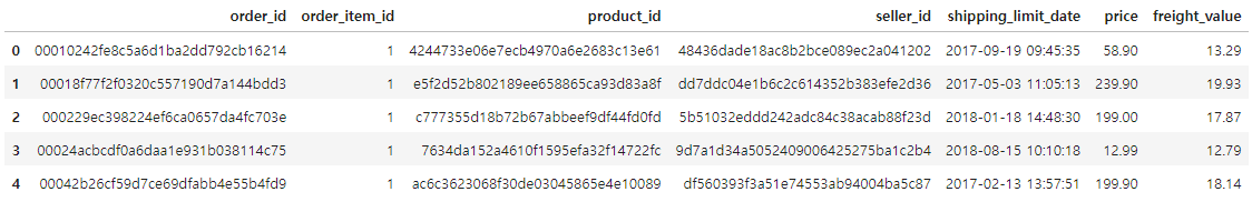
order_items.head()
payments.head()

orders 의 구매 날짜와 payments 의 총 구매 금액을 가지고 월 별 평균 거래액 분석을 하기로 함
orders.info()

결측 데이터 확인하기
- isnull().sum() 사용
orders.isnull().sum()

모든 데이터가 있는 데이터만 공식적인 데이터로 사용하기로 함
- 없는 데이터 삭제하기
orders = orders.dropna()
orders.isnull().sum()

orders.info()

- payments 는 없는 데이터가 없는 상태
payments.isnull().sum()

- orders 와 payments 사이즈 비교
payments.info()

orders.info()

order_id 중 중복된 데이터가 있는지 확인
- value_counts(): 각 값이 전체에서 중복된 횟수를 리턴 (unique할 경우, 1을 리턴)
- max(): 최대값 가져오기
- value_counts().max(): 최대 중복된 데이터의 횟수 리턴
orders['order_id'].value_counts().max()
1
payments['order_id'].value_counts().max()
29
payments['order_id'].value_counts()

payments[payments['order_id'] == 'fa65dad1b0e818e3ccc5cb0e39231352']

중복된 order_id 에 대한 지불 가격을 합치기로 함
- 중복된 order_id 에 대해 orders 필드 값이 덮어 씌워져서 본래 orders 보다 많은 행이 생긴 것임
payments = payments.groupby('order_id').sum()
payments[payments.index == 'fa65dad1b0e818e3ccc5cb0e39231352']

orders 의 구매 날짜와 payments 의 총 지불 금액을 합침
merged_order = pd.merge(orders, payments, on='order_id')
merged_order.info()
merged_order[merged_order['order_id'] == 'fa65dad1b0e818e3ccc5cb0e39231352']

4.2. pandas 로 날짜 다루기
시계열 자료와 pandas
- 년도 별, 월 별, 일 별, 시 별, 분별 초 별등 시간의 흐름에 따라 관측된 자료
- pandas 에서 시계열 자료를 손쉽게 다룰 수 있도록, datetime (datetime64) 자료형 제공
- pandas.to_datetime() 함수를 사용해서, 날짜와 시간을 나타내는 문자열을 datetime (datetime64) 자료형으로 변경 가능
pandas.to_datetime() 사용법
- 문자열 타입의 시간을 pandas 의 datetime (datetime64) 형으로 변경
- 주요 사용법
- Series 변수 = to_datetime(Series 변수)
- return 된 Series 변수 데이터는 datetime64 형으로 변형되어 저장
- Series 변수 = to_datetime(Series 변수, format='~~~')
- Series 에 변환될 문자열이 특별한 포맷을 가져서, 자동 변환이 어려운 경우 명시적으로 format 지정 (옵션)
- Series 변수 = to_datetime(Series 변수, errors='raise')
- 디폴트 raise
- errors 가능한 값: ignore(무시), raise(에러 발생), coerce(NaT 로 값 변경해서 저장) (옵션)
- Series 변수 = to_datetime(Series 변수)

order 한 시간 정보 데이터만 datetime64 로 변환하기
# 지금까지 작성한 부분을 한데 모아서 한번에 실행
import pandas as pd
PATH = "00_data/"
payments = pd.read_csv(PATH + "olist_order_payments_dataset.csv", encoding='utf-8-sig')
orders = pd.read_csv(PATH + "olist_orders_dataset.csv", encoding='utf-8-sig')
orders = orders.dropna()
payments = payments.groupby('order_id').sum()
merged_order = pd.merge(orders, payments, on='order_id')
merged_order.info()

merged_order.head(1)

merged_order['order_purchase_timestamp'] = pd.to_datetime(merged_order['order_purchase_timestamp'], format='%Y-%m-%d %H:%M:%S', errors='raise')
merged_order.info()

pandas.DataFrame.copy
- 데이터 프레임 중 일부를 선택 후, 조작하면 해당 데이터 프레임도 변경
- copy() 를 통해, 복사본을 만들어서 조작하여, 원본 데이터 프레임은 보존 가능
merged_order_payment_date = merged_order[['order_purchase_timestamp', 'payment_value']].copy()
merged_order_payment_date.head()

4.3. 시간대 별 거래액 확인하기
pandas.Grouper
- pandas groupby 명령에 보다 세부적인 grouping 이 가능토록 하는 명령
- pandas groupby 함수와 함께 쓰여서, 시간 별로 데이터를 분류할 수 있는 기능
- 특정 시간 별로 grouping 할 수 있음
데이터프레임.groupby(pd.Groper(key='그루핑기준이되는 컬럼', freq='세부 기준'))
freq 옵션: https://pandas.pydata.org/pandas-docs/stable/user_guide/timeseries.html#offset-aliases
4.3.1 월별 거래액 확인하기
merged_order_month_sum = merged_order_payment_date.groupby(pd.Grouper(key='order_purchase_timestamp', freq='M')).sum() # key 는 기본이 index 임
merged_order_month_sum.head()

시각화해서 트렌드 확인하기
import chart_studio.plotly as py
import cufflinks as cf
cf.go_offline(connected=True)
merged_order_month_sum.iplot(kind='bar', theme='white')

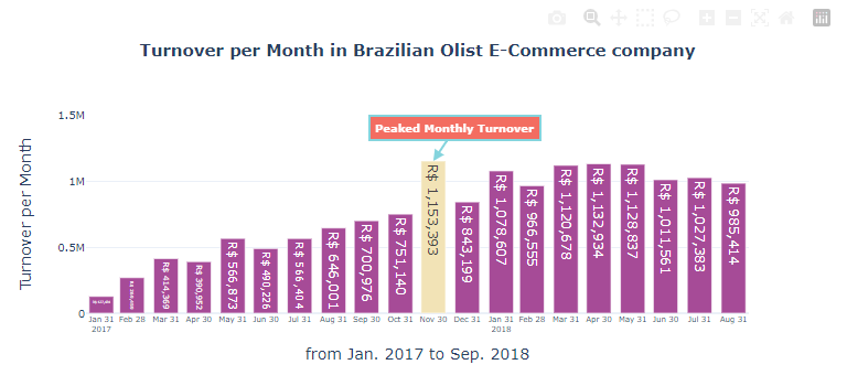
월별 평균 거래액
merged_order_month_sum['payment_value'].mean()
670420.9934782608
merged_order_month_sum.tail()

merged_order_month_sum['payment_value'][3:].mean()
768619.6014999999
최대 거래액을 기록한 월
merged_order_month_sum[merged_order_month_sum['payment_value'] == merged_order_month_sum['payment_value'].max()]

4.4. 월 별 거래액 시각화
지금까지의 데이터 전처리
# 지금까지 작성한 부분을 한데 모아서 한번에 실행 (주피터 노트북 중간부터 들으신다면...)
import pandas as pd
PATH = "00_data/"
payments = pd.read_csv(PATH + "olist_order_payments_dataset.csv", encoding='utf-8-sig')
orders = pd.read_csv(PATH + "olist_orders_dataset.csv", encoding='utf-8-sig')
orders = orders.dropna()
payments = payments.groupby('order_id').sum()
merged_order = pd.merge(orders, payments, on='order_id')
merged_order['order_purchase_timestamp'] = pd.to_datetime(merged_order['order_purchase_timestamp'], format='%Y-%m-%d %H:%M:%S', errors='raise')
merged_order_payment_date = merged_order[['order_purchase_timestamp', 'payment_value']].copy()
merged_order_month_sum = merged_order_payment_date.groupby(pd.Grouper(key='order_purchase_timestamp', freq='M')).sum() # key 는 기본이 index 임
1. plotly 세부 수정
merged_order_month_sum

import plotly.graph_objects as go
fig = go.Figure()
fig.add_trace(
    go.Bar(
        x=merged_order_month_sum.index,
        y=merged_order_month_sum['payment_value'],
        text=merged_order_month_sum['payment_value'],
        textposition='auto',
        texttemplate='R$ %{text:.0f}'
    )
)

fig.update_layout(
    {
        "title": {
            "text": "<b>Turnover per Month in Brazilian Olist E-Commerce company</b>",
            "x": 0.5,
            "y": 0.9,
            "font": {
                "size": 15
            }
        },
        "xaxis": {
            "title": "from Oct. 2016 to Sep. 2018",
            "showticklabels":True,
            "dtick": "M1",
            "tickfont": {
                "size": 7
            }
        },
        "yaxis": {
            "title": "Turnover per Month"
        }
    }
)

fig.show()

2. 불필요한 데이터 삭제
merged_order_month_sum_from2017 = merged_order_month_sum[merged_order_month_sum.index > '2017-01-01']
merged_order_month_sum_from2017

import plotly.graph_objects as go
fig = go.Figure()
fig.add_trace(
    go.Bar(
        x=merged_order_month_sum_from2017.index,
        y=merged_order_month_sum_from2017['payment_value'],
        text=merged_order_month_sum_from2017['payment_value'],
        textposition='auto',
        texttemplate='R$ %{text:.0f}'
    )
)

fig.update_layout(
    {
        "title": {
            "text": "<b>Turnover per Month in Brazilian Olist E-Commerce company</b>",
            "x": 0.5,
            "y": 0.9,
            "font": {
                "size": 15
            }
        },
        "xaxis": {
            "title": "from Jan. 2017 to Sep. 2018",
            "showticklabels":True,
            "dtick": "M1",
            "tickfont": {
                "size": 7
            }
        },
        "yaxis": {
            "title": "Turnover per Month"
        }
    }
)

fig.show()

3. 그래프 테마 변경
import plotly.io as pio
pio.templates

import plotly.graph_objects as go
for template in pio.templates:
    fig = go.Figure()
    fig.add_trace(
        go.Bar(
            x=merged_order_month_sum_from2017.index,
            y=merged_order_month_sum_from2017['payment_value'],
            text=merged_order_month_sum_from2017['payment_value'],
            textposition='auto',
            texttemplate='R$ %{text:.0f}'
        )
    )
    fig.update_layout(
        {
            "title": {
                "text": "<b>Turnover per Month in Brazilian Olist E-Commerce company</b> by " + template,
                "x": 0.5,
                "y": 0.9,
                "font": {
                    "size": 15
                }
            },
            "xaxis": {
                "title": "from Feb. 2017 to Sep. 2018",
                "showticklabels":True,
                "tick0": "2017-01-31", # 처음 tick 을 설정을 해주지 않을 경우, x 축이 밀리는 경우가 있음
                "dtick": "M1", # 한 달 단위로 tick 설정
                "tickfont": {
                    "size": 7
                }
            },
            "yaxis": {
                "title": "Turnover per Month"
            },
            "template":template
        }
    )
    fig.show()

4. 원하는 테마로 최종 선택
import plotly.graph_objects as go

fig = go.Figure()
fig.add_trace(
    go.Bar(
        x=merged_order_month_sum_from2017.index,
        y=merged_order_month_sum_from2017['payment_value'],
        text=merged_order_month_sum_from2017['payment_value'],
        textposition='auto',
        texttemplate='R$ %{text:,.0f}'
    )
)
fig.update_layout(
    {
        "title": {
            "text": "<b>Turnover per Month in Brazilian Olist E-Commerce company</b>",
            "x": 0.5,
            "y": 0.9,
            "font": {
                "size": 15
            }
        },
        "xaxis": {
            "title": "from Jan. 2017 to Sep. 2018",
            "showticklabels":True,
            "tick0": "2017-01-31", # 처음 tick 을 설정을 해주지 않을 경우, x 축이 밀리는 경우가 있음
            "dtick": "M1", # 한 달 단위로 tick 설정
            "tickfont": {
                "size": 7
            }
        },
        "yaxis": {
            "title": "Turnover per Month"
        },
        "template":'plotly_white'
    }
)
fig.show()

5. bar 색상 바꾸기 (최대 거래액을 가진 달은 별도 색상으로 변경하기)
colors = ['#A64B97',] * len(merged_order_month_sum_from2017.index)
colors[10] = '#F2E3B6'
import plotly.graph_objects as go

fig = go.Figure()
fig.add_trace(
    go.Bar(
        x=merged_order_month_sum_from2017.index,
        y=merged_order_month_sum_from2017['payment_value'],
        text=merged_order_month_sum_from2017['payment_value'],
        textposition='auto',
        texttemplate='R$ %{text:,.0f}',
        marker_color=colors
    )
)
fig.update_layout(
    {
        "title": {
            "text": "<b>Turnover per Month in Brazilian Olist E-Commerce company</b>",
            "x": 0.5,
            "y": 0.9,
            "font": {
                "size": 15
            }
        },
        "xaxis": {
            "title": "from Jan. 2017 to Aug. 2018",
            "showticklabels":True,
            "tick0": "2017-01-31",
            "dtick": "M1",
            "tickfont": {
                "size": 7
            }
        },
        "yaxis": {
            "title": "Turnover per Month",
            "tickfont": {
                "size": 10
            }
        },
        "template":'plotly_white'
    }
)

fig.show()

6. annotation 추가하기
- 참고 사이트: https://plotly.com/python/text-and-annotations/
- 상세 션: https://plotly.com/python/reference/#layout-annotations
import plotly.graph_objects as go

fig = go.Figure()
fig.add_trace(
    go.Bar(
        x=merged_order_month_sum_from2017.index,
        y=merged_order_month_sum_from2017['payment_value'],
        text=merged_order_month_sum_from2017['payment_value'],
        textposition='auto',
        texttemplate='R$ %{y:,.0f}',
        marker_color=colors
    )
)
fig.update_layout(
    {
        "title": {
            "text": "<b>Turnover per Month in Brazilian Olist E-Commerce company</b>",
            "x": 0.5,
            "y": 0.9,
            "font": {
                "size": 15
            }
        },
        "xaxis": {
            "title": "from Jan. 2017 to Sep. 2018",
            "showticklabels":True,
            "tick0": "2017-01-31",
            "dtick": "M1",
            "tickfont": {
                "size": 7
            }
        },
        "yaxis": {
            "title": "Turnover per Month",
            "tickfont": {
                "size": 10
            }
        },
        "template":'plotly_white'
    }
)

fig.add_annotation(
            x="2017-11-30",
            y=1153393,
            text="<b>Peaked Monthly Turnover</b>",
            showarrow=True,
            font=dict(
                size=10,
                color="#ffffff"
                ),
            align="center",
            arrowhead=2,
            arrowsize=1,
            arrowwidth=2,
            arrowcolor="#77CFD9",
            ax=20,
            ay=-30,
            bordercolor="#77CFD9",
            borderwidth=2,
            borderpad=4,
            bgcolor="#F25D50",
            opacity=0.9
)

fig.show()
4.5. 월 별 거래 건수 확인하기
# order_purchase_timestamp 의 날짜 데이터를 기반으로 월별 계산을 해야 하므로 datetime 타입으로 변환
merged_order_payment_date['order_purchase_timestamp'] = pd.to_datetime(merged_order_payment_date['order_purchase_timestamp'], format='%Y-%m-%d %H:%M:%S', errors='raise')
merged_order_payment_date = merged_order_payment_date.set_index('order_purchase_timestamp')

merged_order_month_count = merged_order_payment_date.groupby(pd.Grouper(freq='M')).count() # key 는 기본이 index 임
merged_order_month_count.head()

import chart_studio.plotly as py
import cufflinks as cf
cf.go_offline(connected=True)
merged_order_month_count.iplot(kind='bar', theme='white')

4.6. 일 별 거래액 확인하기
merged_order_date_sum = merged_order_payment_date.groupby(pd.Grouper(freq='D')).sum() # key 는 기본이 index 임
merged_order_date_sum.head()

merged_order_date_sum.iplot(kind='line', theme='white')

4.7. 시간대 별 분석
merged_order_payment_date = merged_order[['order_purchase_timestamp', 'payment_value']].copy()
merged_order_payment_date.head()

팁: pandas 버전별로 지원 기능, 변수/함수명이 변경되는 경우가 있음
- dir() 함수를 통해 지원되는 기능/변수/함수명을 대략적으로 파악할 수 있음
# order_purchase_timestamp 의 날짜 데이터를 기반으로 월별 계산을 해야 하므로 datetime 타입으로 변환
merged_order_payment_date['order_purchase_timestamp'] = pd.to_datetime(merged_order_payment_date['order_purchase_timestamp'], format='%Y-%m-%d %H:%M:%S', errors='raise')

merged_order_payment_date.info()

dir(merged_order_payment_date['order_purchase_timestamp'].dt)

merged_order_payment_date['order_purchase_timestamp'].dt.quarter
사전 설정
- datetime 필드는 dt.시간 별로 필요한 부분만 추출 가능
merged_order_payment_date['year'] = merged_order_payment_date['order_purchase_timestamp'].dt.year
merged_order_payment_date['monthday'] = merged_order_payment_date['order_purchase_timestamp'].dt.day
merged_order_payment_date['weekday'] = merged_order_payment_date['order_purchase_timestamp'].dt.weekday
merged_order_payment_date['month'] = merged_order_payment_date['order_purchase_timestamp'].dt.month
merged_order_payment_date['hour'] = merged_order_payment_date['order_purchase_timestamp'].dt.hour
merged_order_payment_date['quarter'] = merged_order_payment_date['order_purchase_timestamp'].dt.quarter
merged_order_payment_date['minute'] = merged_order_payment_date['order_purchase_timestamp'].dt.minute
merged_order_payment_date.head()
