
SUBPLOTS
matplotlib.pyplot.subplots
- matplotlib.pyplot.subplots(nrows=1, ncols=1, *, sharex=False, sharey=False, squeeze=True, width_ratios=None, height_ratios=None, subplot_kw=None, gridspec_kw=None, **fig_kw)
import numpy as np
import matplotlib.pyplot as plt
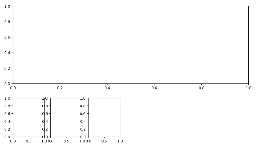
fig, ax = plt.subplots(nrows=2, ncols=2)
plt.show()

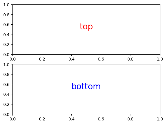
import numpy as np
import matplotlib.pyplot as plt

fig, (ax1, ax2) = plt.subplots(nrows=2, ncols=1)
ax1.text(0.5, 0.5,
            'top',
             color = 'red',
             fontsize = '20',
             ha = 'center'
        )
ax2.text(0.5, 0.5,
            'bottom',
             color = 'blue',
             fontsize = '20',
             ha = 'center'
        )
plt.show()
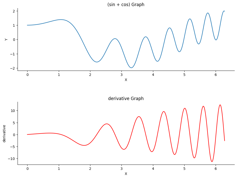
import numpy as np
import matplotlib.pyplot as plt

fig, (ax1, ax2) = plt.subplots(nrows=2, ncols=1, figsize = (11,8))

x = np.linspace(0, 2*np.pi, 400)
y = np.sin(x**2) + np.cos(x)

derivative = 2 * x * np.cos(x**2) - np.sin(x)

plt.subplots_adjust(wspace = 0, hspace = 0.5)

ax1.set(
    xlabel = 'X',
    ylabel = 'Y',
    title = '(sin + cos) Graph'
)

ax2.set(
    xlabel = 'X',
    ylabel = 'derivative',
    title = 'derivative Graph'
)

ax1.plot(x,y)
ax1.spines['top'].set_color('none')
ax1.spines['right'].set_color('none')

ax2.plot(x,derivative, 'r')
ax2.spines['top'].set_color('none')
ax2.spines['right'].set_color('none')

plt.show()
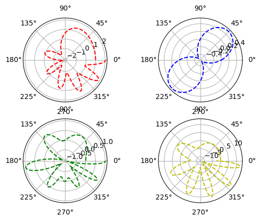
import numpy as np
import matplotlib.pyplot as plt

fig, ax = plt.subplots(nrows=2, ncols=2, figsize = (11,8), subplot_kw = dict(polar = True))

import numpy as np
import matplotlib.pyplot as plt

x = np.linspace(0, 2*np.pi, 400)
y = np.sin(x**2) + np.cos(x)
y1 = np.sin(x)*np.cos(x)
y2 = np.sin(x**2)*np.cos(x)
derivative = 2 * x * np.cos(x**2) - np.sin(x)

fig, ax = plt.subplots(nrows=2, ncols=2, subplot_kw = dict(polar = True))
ax[0][0].plot(x, y, 'r--')
ax[0][1].plot(x, y1, 'b--')
ax[1][0].plot(x, y2, 'g--')
ax[1][1].plot(x, derivative, 'y--')

plt.show()
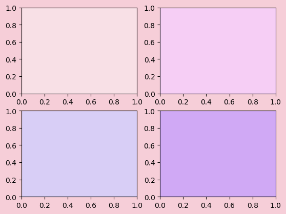
import numpy as np
import matplotlib.pyplot as plt

fig, ax = plt.subplots(nrows=2, ncols=2, facecolor = '#F6CED8')

ax[0,0].set_facecolor('#F8E0E6')
ax[0,1].set_facecolor('#F6CEF5')
ax[1,0].set_facecolor('#D8CEF6')
ax[1,1].set_facecolor('#D0A9F5')
import numpy as np
import matplotlib.pyplot as plt

plt.figure(figsize = (11,8))
ax1 = plt.subplot(211)
plt.figure(figsize = (5,4))
ax2 = plt.subplot(234)
ax3 = plt.subplot(235)
ax4 = plt.subplot(236)
import matplotlib.gridspec as gridspec
import matplotlib.pyplot as plt
plt.figure(figsize=(6, 4))
G = gridspec.GridSpec(3, 3)
axes_1 = plt.subplot(G[0, :])
axes_1.set_xticks(())
axes_1.set_yticks(())
axes_1.text(0.5, 0.5, 'Axes 1',
ha='center', va='center',
size=24, alpha=.5)
axes_2 = plt.subplot(G[1, :-1])
axes_2.set_xticks(())
axes_2.set_yticks(())
axes_2.text(0.5, 0.5, 'Axes 2',
ha='center', va='center',
size=24, alpha=.5)
axes_3 = plt.subplot(G[1:, -1])
axes_3.set_xticks(())
axes_3.set_yticks(())
axes_3.text(0.5, 0.5, 'Axes 3',
ha='center', va='center',
size=24, alpha=.5)
axes_4 = plt.subplot(G[-1, 0])
axes_4.set_xticks(())
axes_4.set_yticks(())
axes_4.text(0.5, 0.5, 'Axes 4',
ha='center', va='center',
size=24, alpha=.5)
axes_5 = plt.subplot(G[-1, -2])
axes_5.set_xticks(())
axes_5.set_yticks(())
axes_5.text(0.5, 0.5, 'Axes 5',
ha='center', va='center',
size=24, alpha=.5)
plt.tight_layout()
plt.show()
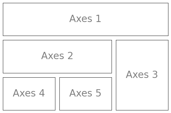
Image Precessing
matplotlib.pyplot.imread
- matplotlib.pyplot.imread(fname, format=None)
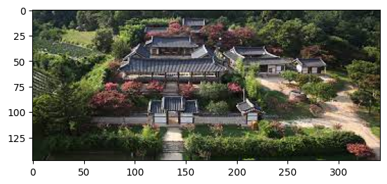
import matplotlib.pyplot as plt

img = plt.imread('./image.jpg')
img
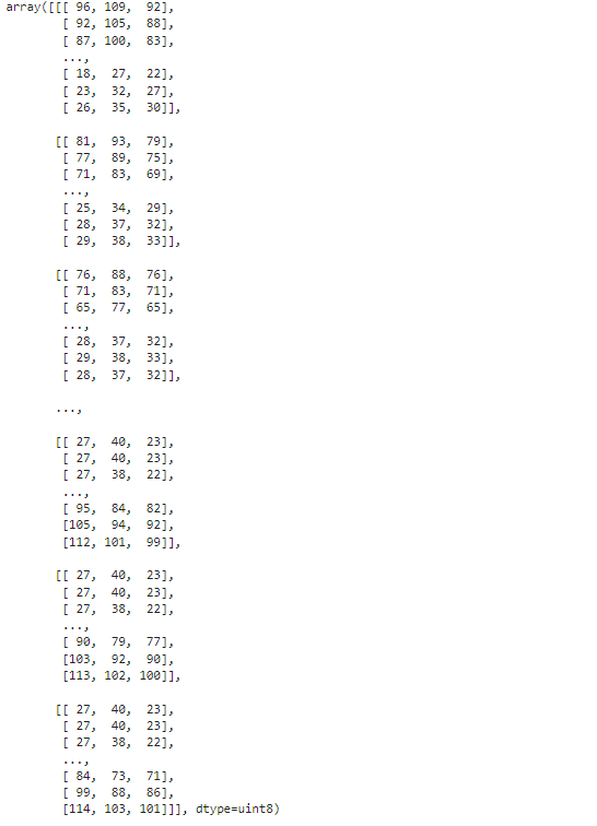
img.shape
(148, 341, 3)
plt.imshow(img)
import matplotlib.gridspec as gridspec
import matplotlib.pyplot as plt
plt.figure(figsize=(6, 4))
G = gridspec.GridSpec(3, 3)
axes_1 = plt.subplot(G[0, :])
axes_1.set_xticks(())
axes_1.set_yticks(())
axes_1.text(0.5, 0.5, 'Axes 1',
ha='center', va='center',
size=24, alpha=.5)
axes_2 = plt.subplot(G[1, :-1])
axes_2.set_xticks(())
axes_2.set_yticks(())
axes_2.text(0.5, 0.5, 'Axes 2',
ha='center', va='center',
size=24, alpha=.5)
axes_3 = plt.subplot(G[1:, -1])
axes_3.set_xticks(())
axes_3.set_yticks(())
axes_3.text(0.5, 0.5, 'Axes 3',
ha='center', va='center',
size=24, alpha=.5)
axes_4 = plt.subplot(G[-1, 0])
axes_4.set_xticks(())
axes_4.set_yticks(())
axes_4.text(0.5, 0.5, 'Axes 4',
ha='center', va='center',
size=24, alpha=.5)
axes_5 = plt.subplot(G[-1, -2])
axes_5.set_xticks(())
axes_5.set_yticks(())
axes_5.text(0.5, 0.5, 'Axes 5',
ha='center', va='center',
size=24, alpha=.5)
plt.tight_layout()
plt.show()
'빅데이터 분석가 양성과정 > Python' 카테고리의 다른 글
| pandas_COVID-19 ( 1 ) (0) | 2024.07.09 |
|---|---|
| Pandas (0) | 2024.07.09 |
| Matplotlib ( 1 ) (0) | 2024.07.09 |
| Numpy ( 3 ) (1) | 2024.07.09 |
| Numpy ( 2 ) (0) | 2024.07.09 |