
x축, y축에 축명을 텍스트로 할당. xlabel, ylabel 적용
plt.plot(x_value, y_value, color='red', marker='o', linestyle='dashed', linewidth=2, markersize=12)
plt.xlabel('x axis')
plt.ylabel('y axis')
plt.show()
x축, y축 틱값을 표현을 회전해서 보여줌. x축값이 문자열이고 많은 tick값이 있을 때 적용
x_value = np.arange(1, 100)
y_value = 2*x_value

plt.plot(x_value, y_value, color='green')
plt.xlabel('x axis')
plt.ylabel('y axis')

plt.xticks(rotation=45)
#plt.yticks(rotation=45)

plt.title('Hello plot')
plt.show()
x_value = np.arange(0, 100)
y_value = 2*x_value

plt.plot(x_value, y_value, color='green')
plt.xlabel('x axis')
plt.ylabel('y axis')

plt.xticks(ticks=np.arange(0, 100,5), rotation=90)
plt.yticks(rotation=45)

plt.title('Hello plot')
plt.show()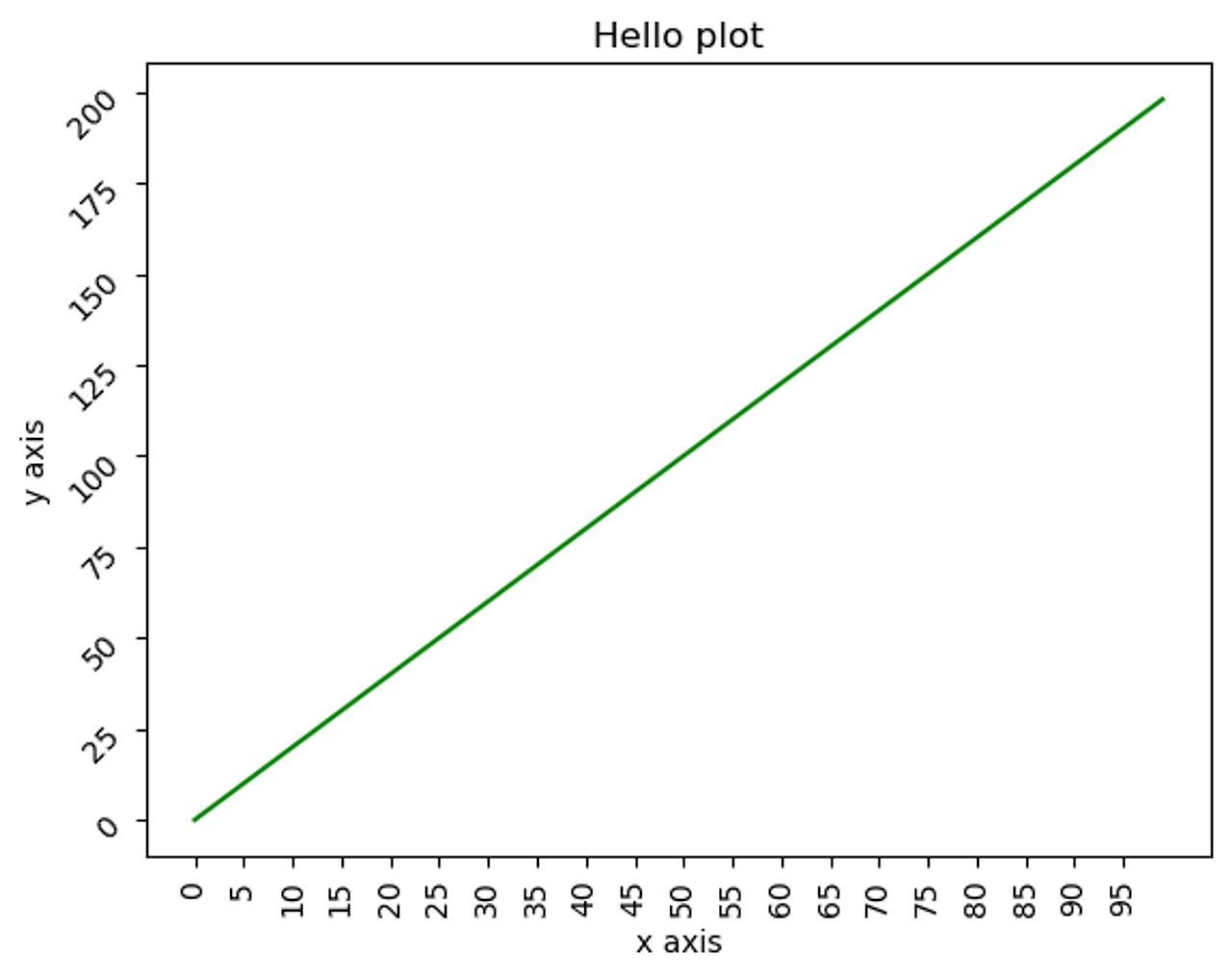
xlim()은 x축값을 제한하고, ylim()은 y축값을 제한
x_value = np.arange(0, 100)
y_value = 2*x_value

plt.plot(x_value, y_value, color='green')
plt.xlabel('x axis')
plt.ylabel('y axis')

# x축값을 0에서 50으로, y축값을 0에서 100으로 제한.
plt.xlim(0, 50)
plt.ylim(0, 100)

plt.title('Hello plot')

plt.show()
범례 설정하기
x_value = np.arange(1, 100)
y_value = 2*x_value

plt.plot(x_value, y_value, color='green', label='temp')
plt.xlabel('x axis')
plt.ylabel('y axis')

plt.legend()

plt.title('Hello plot')

plt.show()
matplotlib을 여러개의 plot을 하나의 Axes내에서 그릴 수 있음
x_value_01 = np.arange(1, 100)
#x_value_02 = np.arange(1, 200)
y_value_01 = 2*x_value_01
y_value_02 = 4*x_value_01

plt.plot(x_value_01, y_value_01, color='green', label='temp_01')
plt.plot(x_value_01, y_value_02, color='red', label='temp_02')
plt.xlabel('x axis')
plt.ylabel('y axis')

plt.legend()

plt.title('Hello plot')

plt.show()
x_value_01 = np.arange(1, 10)
#x_value_02 = np.arange(1, 200)
y_value_01 = 2*x_value_01
y_value_02 = 4*x_value_01

plt.plot(x_value_01, y_value_01, color='red', marker='o', linestyle='dashed', linewidth=2, markersize=6, label='temp_01')
plt.bar(x_value_01, y_value_01, color='green', label='temp_02')
plt.xlabel('x axis')
plt.ylabel('y axis')

plt.legend()

plt.title('Hello plot')

plt.show()
Axes 객체에서 직접 작업
figure = plt.figure(figsize=(10, 6))
ax = plt.axes()

ax.plot(x_value_01, y_value_01, color='red', marker='o', linestyle='dashed', linewidth=2, markersize=6, label='temp_01')
ax.bar(x_value_01, y_value_01, color='green', label='temp_02')
ax.set_xlabel('x axis')
ax.set_ylabel('y axis')

ax.legend() # set_legend()가 아니라 legend()임.
ax.set_title('Hello plot')

plt.show()
여러개의 subplots을 가지는 Figure를 생성하고 여기에 개별 그래프를 시각
- nrows가 1일 때는 튜플로 axes를 받을 수 있음.
- nrows나 ncols가 1일때는 1차원 배열형태로, nrows와 ncols가 1보다 클때는 2차원 배열형태로 axes를 추출해야 함.
x_value_01 = np.arange(1, 10)
x_value_02 = np.arange(1, 20)
y_value_01 = 2 * x_value_01
y_value_02 = 2 * x_value_02

fig, (ax_01, ax_02) = plt.subplots(nrows=1, ncols=2, figsize=(12, 6))

ax_01.plot(x_value_01, y_value_01, color='red', marker='o', linestyle='dashed', linewidth=2, markersize=6, label='temp_01')
ax_02.bar(x_value_02, y_value_02, color='green', label='temp_02')

ax_01.set_xlabel('ax_01 x axis')
ax_02.set_xlabel('ax_02 x axis')

ax_01.legend()
ax_02.legend()

#plt.legend()
plt.show()
import numpy as np

x_value_01 = np.arange(1, 10)
x_value_02 = np.arange(1, 20)
y_value_01 = 2 * x_value_01
y_value_02 = 2 * x_value_02

fig, ax = plt.subplots(nrows=1, ncols=2, figsize=(12, 6))

ax[0].plot(x_value_01, y_value_01, color='red', marker='o', linestyle='dashed', linewidth=2, markersize=6, label='temp_01')
ax[1].bar(x_value_02, y_value_02, color='green', label='temp_02')

ax[0].set_xlabel('ax[0] x axis')
ax[1].set_xlabel('ax[1] x axis')

ax[0].legend()
ax[1].legend()

#plt.legend()
plt.show()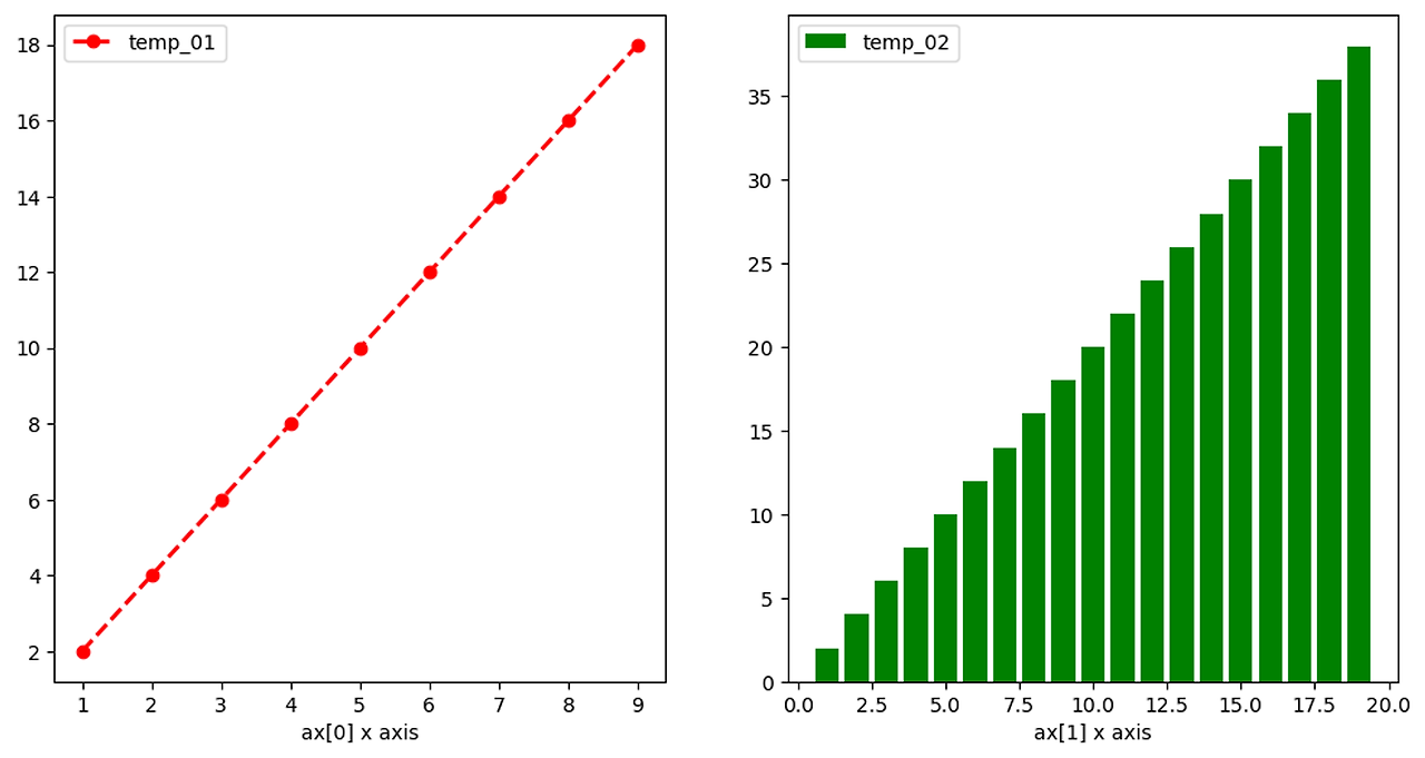
import numpy as np

x_value_01 = np.arange(1, 10)
x_value_02 = np.arange(1, 20)
y_value_01 = 2 * x_value_01
y_value_02 = 2 * x_value_02

fig, ax = plt.subplots(nrows=2, ncols=2, figsize=(12, 6))

ax[0][0].plot(x_value_01, y_value_01, color='red', marker='o', linestyle='dashed', linewidth=2, markersize=6, label='temp_01')
ax[0][1].bar(x_value_02, y_value_02, color='green', label='temp_02')
ax[1][0].plot(x_value_01, y_value_01, color='green', marker='o', linestyle='dashed', linewidth=2, markersize=6, label='temp_03')
ax[1][1].bar(x_value_02, y_value_02, color='red', label='temp_04')

ax[0][0].set_xlabel('ax[0][0] x axis')
ax[0][1].set_xlabel('ax[0][1] x axis')
ax[1][0].set_xlabel('ax[1][0] x axis')
ax[1][1].set_xlabel('ax[1][1] x axis')

ax[0][0].legend()
ax[0][1].legend()
ax[1][0].legend()
ax[1][1].legend()

#plt.legend()
plt.show()
'빅데이터 분석가 양성과정 > Python' 카테고리의 다른 글
| Seaborn - Titanic Dataset ( histogram ) (0) | 2024.07.06 |
|---|---|
| Seaborn (1) | 2024.07.06 |
| Matplotlib(1) (0) | 2024.07.06 |
| 데이터 시각화 기초(3) (1) | 2024.07.05 |
| 데이터 시각화 기초(2) (2) | 2024.07.05 |
x축, y축에 축명을 텍스트로 할당. xlabel, ylabel 적용
      python


    plt.plot(x_value, y_value, color='red', marker='o', linestyle='dashed', linewidth=2, markersize=12)
plt.xlabel('x axis')
plt.ylabel('y axis')
plt.show()
x축, y축 틱값을 표현을 회전해서 보여줌. x축값이 문자열이고 많은 tick값이 있을 때 적용
      python


    x_value = np.arange(1, 100)
y_value = 2*x_value

plt.plot(x_value, y_value, color='green')
plt.xlabel('x axis')
plt.ylabel('y axis')

plt.xticks(rotation=45)
#plt.yticks(rotation=45)

plt.title('Hello plot')
plt.show()
      python


    x_value = np.arange(0, 100)
y_value = 2*x_value

plt.plot(x_value, y_value, color='green')
plt.xlabel('x axis')
plt.ylabel('y axis')

plt.xticks(ticks=np.arange(0, 100,5), rotation=90)
plt.yticks(rotation=45)

plt.title('Hello plot')
plt.show()
xlim()은 x축값을 제한하고, ylim()은 y축값을 제한
      python


    x_value = np.arange(0, 100)
y_value = 2*x_value

plt.plot(x_value, y_value, color='green')
plt.xlabel('x axis')
plt.ylabel('y axis')

# x축값을 0에서 50으로, y축값을 0에서 100으로 제한.
plt.xlim(0, 50)
plt.ylim(0, 100)

plt.title('Hello plot')

plt.show()
범례 설정하기
      python


    x_value = np.arange(1, 100)
y_value = 2*x_value

plt.plot(x_value, y_value, color='green', label='temp')
plt.xlabel('x axis')
plt.ylabel('y axis')

plt.legend()

plt.title('Hello plot')

plt.show()
matplotlib을 여러개의 plot을 하나의 Axes내에서 그릴 수 있음
      python


    x_value_01 = np.arange(1, 100)
#x_value_02 = np.arange(1, 200)
y_value_01 = 2*x_value_01
y_value_02 = 4*x_value_01

plt.plot(x_value_01, y_value_01, color='green', label='temp_01')
plt.plot(x_value_01, y_value_02, color='red', label='temp_02')
plt.xlabel('x axis')
plt.ylabel('y axis')

plt.legend()

plt.title('Hello plot')

plt.show()
      python


    x_value_01 = np.arange(1, 10)
#x_value_02 = np.arange(1, 200)
y_value_01 = 2*x_value_01
y_value_02 = 4*x_value_01

plt.plot(x_value_01, y_value_01, color='red', marker='o', linestyle='dashed', linewidth=2, markersize=6, label='temp_01')
plt.bar(x_value_01, y_value_01, color='green', label='temp_02')
plt.xlabel('x axis')
plt.ylabel('y axis')

plt.legend()

plt.title('Hello plot')

plt.show()
Axes 객체에서 직접 작업
      python


    figure = plt.figure(figsize=(10, 6))
ax = plt.axes()

ax.plot(x_value_01, y_value_01, color='red', marker='o', linestyle='dashed', linewidth=2, markersize=6, label='temp_01')
ax.bar(x_value_01, y_value_01, color='green', label='temp_02')
ax.set_xlabel('x axis')
ax.set_ylabel('y axis')

ax.legend() # set_legend()가 아니라 legend()임.
ax.set_title('Hello plot')

plt.show()
여러개의 subplots을 가지는 Figure를 생성하고 여기에 개별 그래프를 시각
- nrows가 1일 때는 튜플로 axes를 받을 수 있음.
- nrows나 ncols가 1일때는 1차원 배열형태로, nrows와 ncols가 1보다 클때는 2차원 배열형태로 axes를 추출해야 함.
      python


    x_value_01 = np.arange(1, 10)
x_value_02 = np.arange(1, 20)
y_value_01 = 2 * x_value_01
y_value_02 = 2 * x_value_02

fig, (ax_01, ax_02) = plt.subplots(nrows=1, ncols=2, figsize=(12, 6))

ax_01.plot(x_value_01, y_value_01, color='red', marker='o', linestyle='dashed', linewidth=2, markersize=6, label='temp_01')
ax_02.bar(x_value_02, y_value_02, color='green', label='temp_02')

ax_01.set_xlabel('ax_01 x axis')
ax_02.set_xlabel('ax_02 x axis')

ax_01.legend()
ax_02.legend()

#plt.legend()
plt.show()
      python


    import numpy as np

x_value_01 = np.arange(1, 10)
x_value_02 = np.arange(1, 20)
y_value_01 = 2 * x_value_01
y_value_02 = 2 * x_value_02

fig, ax = plt.subplots(nrows=1, ncols=2, figsize=(12, 6))

ax[0].plot(x_value_01, y_value_01, color='red', marker='o', linestyle='dashed', linewidth=2, markersize=6, label='temp_01')
ax[1].bar(x_value_02, y_value_02, color='green', label='temp_02')

ax[0].set_xlabel('ax[0] x axis')
ax[1].set_xlabel('ax[1] x axis')

ax[0].legend()
ax[1].legend()

#plt.legend()
plt.show()
      python


    import numpy as np

x_value_01 = np.arange(1, 10)
x_value_02 = np.arange(1, 20)
y_value_01 = 2 * x_value_01
y_value_02 = 2 * x_value_02

fig, ax = plt.subplots(nrows=2, ncols=2, figsize=(12, 6))

ax[0][0].plot(x_value_01, y_value_01, color='red', marker='o', linestyle='dashed', linewidth=2, markersize=6, label='temp_01')
ax[0][1].bar(x_value_02, y_value_02, color='green', label='temp_02')
ax[1][0].plot(x_value_01, y_value_01, color='green', marker='o', linestyle='dashed', linewidth=2, markersize=6, label='temp_03')
ax[1][1].bar(x_value_02, y_value_02, color='red', label='temp_04')

ax[0][0].set_xlabel('ax[0][0] x axis')
ax[0][1].set_xlabel('ax[0][1] x axis')
ax[1][0].set_xlabel('ax[1][0] x axis')
ax[1][1].set_xlabel('ax[1][1] x axis')

ax[0][0].legend()
ax[0][1].legend()
ax[1][0].legend()
ax[1][1].legend()

#plt.legend()
plt.show()'빅데이터 분석가 양성과정 > Python' 카테고리의 다른 글
| Seaborn - Titanic Dataset ( histogram ) (0) | 2024.07.06 |
|---|---|
| Seaborn (1) | 2024.07.06 |
| Matplotlib(1) (0) | 2024.07.06 |
| 데이터 시각화 기초(3) (1) | 2024.07.05 |
| 데이터 시각화 기초(2) (2) | 2024.07.05 |